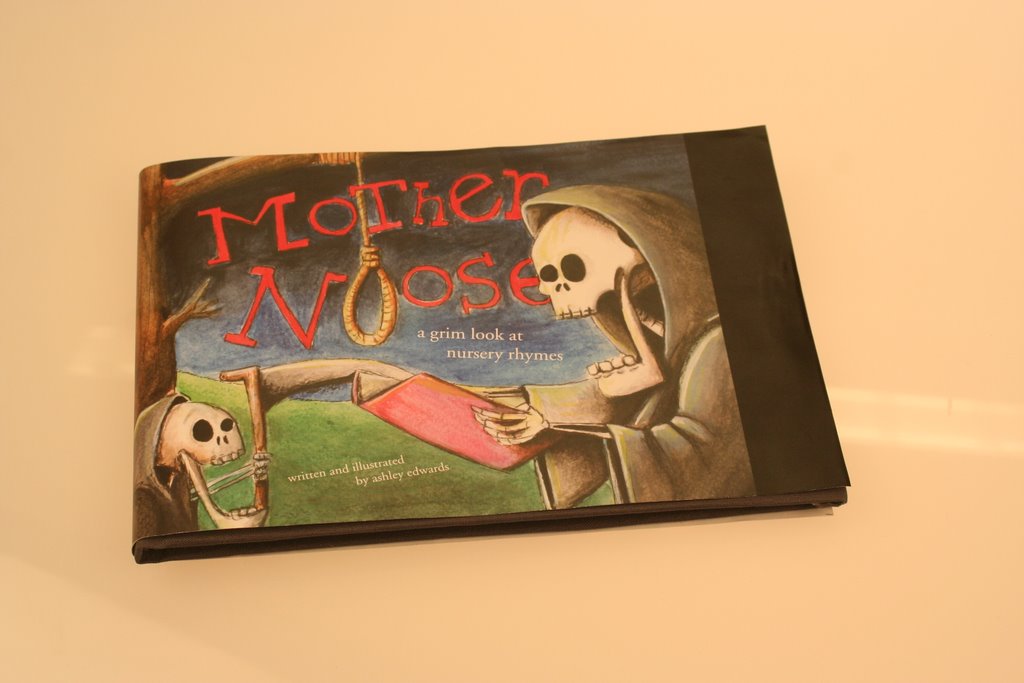


1) Mother Noose is a book about how the rhymes we have learned as children are quite brutal. The book is 5.5 by 8.5 inches and information is organized by rhyme. Seven rhymes are analyzed. The quality of the drawing is meant to resemble children’s books but at the same time be creepy. I chose to use hand written, sloppy type for the rhymes. The reason for this being that the appearance of the writing is unsettling and so adds to the creepy theme. The media used to create the illustrations were watercolours, charcoal, ink, pastels and acrylic paint. The book is formatted in long landscape spreads. The spreads alter every so often in such a way that the reader has to turn the book. This allowed for experimentation with vertical space.
2) Initially I had planned on doing a book on graffiti with a focus of the Toronto scene. A few weeks into the class I changed gears and decided to focus on nursery rhymes. As soon as I had the idea to do my book on nursery rhymes I had a vision for my book that is pretty similar to the final outcome. The only thing that I saw change was the typography. I believe my choice to use messy handwriting added to the feeling of the book.
3)A huge choice I had to make concerning my book was to cut out two nursery rhymes. Initially I had wanted to illustrate 9 but due to time constraints I could only complete 7. Had I not made this choice I would have not only gotten even less sleep than I did on this project, but also, my overall design would have suffered. Had I not stopped my design would have looked scary.
4)I would have liked to be able to finish more rhymes than I did. Though my book is lengthy if the world of children’s books, I still would have liked a few more. Also if money wasn’t an issue I would have liked to fly to Mexico to finish my book on the beach. I think that I would have made the format even longer horizontally if I had to do it all over again. As well I would have taken it to a company to scan. It would have not only saved me a lot of time but also would have made the colours more accurate and improved the overall image quality.
5) Advice I’d give people taking book would be if you want to illustrate your book make sure you have a light semester. It’s a lot of work…a lot, a lot of work. But it is also rewarding. I did find the tight timeline frustrating at times because I couldn’t take my time drawing and designing. I felt rushed most of the time and began to hate sitting and painting (which I generally love).
No comments:
Post a Comment