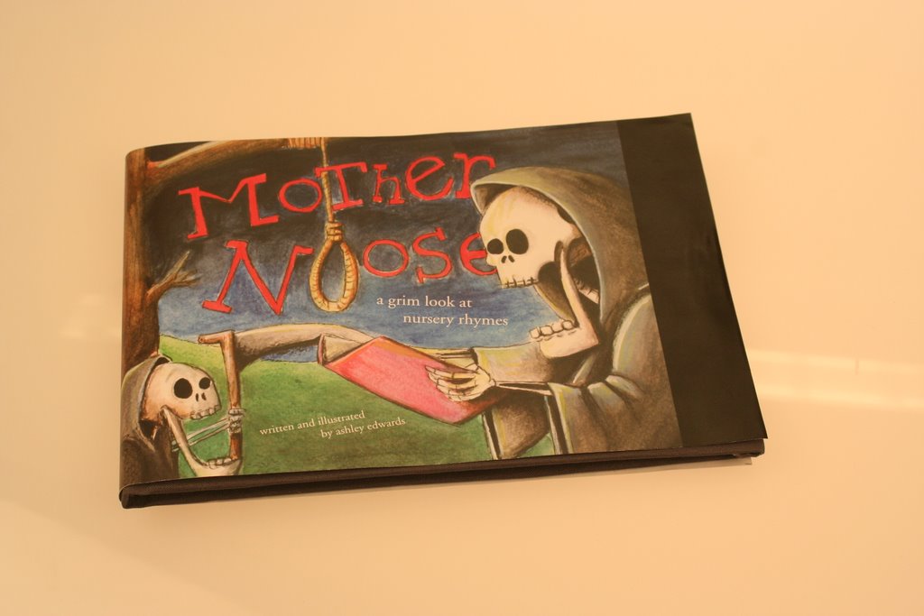

1) My book Mirrors with a Memory takes a look at the beginning of photography. It is a short progression of how photography evolved, but only looking at the 1800s. I wanted my book to be more artistic, then just an account of the history of photography. In order to achieve this, I used many pictures, and a variety of paper, to add texture, and a visual appeal. I wanted the book, to look soft, and did this by only using images that were black and white, or had a slight tint to them.
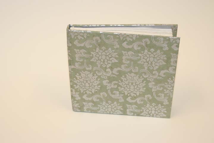
It is a hardcover book that is covered with a decorative paper. I used silver as a key colour, because successful photographic processes used silver iodine, and I wanted that to be represented. I decided not to have the title of the book on the front cover, because I wanted it to be more alluring so that people would not know what the exactly the book was about. This is also why I used an abstract title, to introduce its contents. This is not a history book, so I wanted to make sure that it didn’t come across as one.
2) From the beginning of this process I was unaware of how exactly I would try to achieve what I was trying to convey. I had so many different, conflicting styles of how I might go about achieving my desired effect. Originally I thought I would take the visuals of the book in the direction of collage. I considered incorporating the social aspects of how the introduction of photography affected society, and the advertisements that were produced to sell cameras to consumers. This idea was visually a lot louder then my final product. It incorporated many colours and more visuals incorporated within the type.
Another direction I had planned to take my book incorporated more of a timeline concerning the introduction of photography. I had planned to look at the 1800s to the 1950s; although I found that with this approach my book would have become to cumbersome, and gone away from what I wanted, which was for the reader to have an experience, not a history lesson.
In the end I choice a method that was much more simplistic, that incorporated both an artistic appeal as well as information to support it.
3) Two important choices that I made for my book, was the paper selection and the format I used.
Using a variety of five different paper stocks, added a visual appeal that I would not have been able to incorporate, unless I had used different textures. The colour and the style of the papers contributed to the artistic feel that I wanted to incorporate.
The format also played a roll in the book coming across as being more artistic then a history book, because of its size, and how the pages were laid out. By not having the pictures within the text, and instead, having them on separate sheets of paper, allowed the reader to be able to enjoy the photo and to be able to develop their own interpretation and appreciation for it.
4) I felt that more time would have made a big difference in the production of my book. It would have allowed the finished product to be cleaner and more put together. I plan on getting the book professionally bound, after the class is over. This will allow an additional revision, after I have received comments and criticisms from others.
If I could do something differently, it would have been, to try and decide on a clear plan earlier. I had so many different ideas, that it was difficult for me to just commit on a design and then progress further.
I also feel that one semester is just not enough time, to cover such a vast topic as photography, there is just so many different aspects to the topic, as well as varying information, that only a few months is just not enough time, to thoroughly understand this topic.
5) I enjoyed this class very much, although I would have to say that before you actually take the class it is difficult to fully understand what is involved in the making and the production of book design. One of the difficulties with book is that there are so many variables that need to be considered and planned, before the final stages of the actual completion of the project. Without actually going through these steps it is very difficult to fully understand and visualize the final product.
I also found it difficult to finalize and stick with a particular style. There are so many choices, and different things that can be done, that it is difficult to stick with one concept and carry that all the way though.
My advice to others is to just see what is out there and then decide what course of action to take. I think that it is really important to do a lot of research before you even start designing. Brainstorming is key!!